Studio Thought Seed of Chucky Was ‘Too Gay, Too Funny'
Subtitles
  • Off
  • English

Good Luck if You're Forced to Use These Hideous Federal Websites

Good Luck if You're Forced to Use These Hideous Federal Websites

Think going to the DMV is bad? Try suffering through the Department of Treasury's official securities site.

We may earn a commission from links on this page.
Start Slideshow
A 3D render of the text .gov as if from the pixels on a computer screen
Image: Shutterstock (Shutterstock)

You don’t need to be a user interface designer to spot a bad-looking site. Hell, anyone who spent any time on the internet in the days pre-Facebook might remember bland, white webpages, tiny font, and links upon links upon links like a black hole slowly sucking you into the great whirlpool expanse of incomprehensible electronic morass.

Advertisement

The standards have improved since then, or at least they have for most sites. Government websites have long been notorious for lagging behind the rest of the world in both usability and appearance.

A 2017 report from Information Technology & Innovation Foundation found that a grand total of 92% of 297 of the most popular government websites failed to meet basic standards for an even passable site. The study used four basic criteria to judge these sites: page load speed, mobile friendliness, security, and accessibility.

These government sites at the time failed in multiple ways. A little less than 60% of them were mobile friendly. Just 36% loaded relatively fast on mobile devices since they don’t automatically compress images or loading first-visible parts of the site first. Only 58% were accessible to users with disabilities, especially for those with eyesight-related issues.

The last time Gizmodo pressed this topic was in 2014, and though some of these sites have received an—ahem—“update” since then, you don’t have to look far to find an awful-looking, slow, convoluted webpage with UI choices that seem like they’re actually designed for an alien being with six tentacles instead of thumbs, who only sees in gamma radiation, and who hates legible fonts.

The government has had some problems with creating new sites in the past, like the infamous rollout of Healthcare.gov back in 2013. However, the federal government has seen some relative success with government sites in the pandemic. Both vaccines.gov and covidtests.gov show there are enough heads within the executive branch to get a jump on some of these rougher-looking sites, bringing them up to standard.

For this list, we’ve stuck with federal sites because going through the immense number of bad state and local government sites would probably drive the bravest individual to utter madness. Feel free to drop us a link to what you, dear reader, think is the worst government site you’ve seen. Click through for some of the worst one’s we’ve come across during our reporting, in no particular order.


Advertisement
Previous Slide
Next Slide

2 / 13

Treasury Direct

Treasury Direct

Image for article titled Good Luck if You're Forced to Use These Hideous Federal Websites
Screenshot: Treasury Direct

This website is supposed to let you buy and redeem securities directly from the Department of Treasury. Good luck navigating around the clustered links and early 2000s-era pop art graphics to get where you’re going. The site even has a “guided tour” function that’s supposed to make it clear where you’re supposed to go to sign up, but even that feels like a throwback to the pre-MySpace age when adding more clicks to pages made it easier to navigate. Also, nobody should use a lime green, blue, and orange color palette, please.

Advertisement
Previous Slide
Next Slide

3 / 13

U.S. Commission of Fine Arts

U.S. Commission of Fine Arts

Image for article titled Good Luck if You're Forced to Use These Hideous Federal Websites
Screenshot: U.S. Commission of Fine Arts

Fine Arts, eh? Not really, at least according to your website. Blaring black, yellow, and red makes me feel like I’m looking at a warning signal. No, it’s nowhere near the worst site on this list since it’s at least a little navigable on desktop. But guess what, its mobile version is not much better. I guess I just expected more from the CFA.

Advertisement
Previous Slide
Next Slide

4 / 13

Space Force

Space Force

Image for article titled Good Luck if You're Forced to Use These Hideous Federal Websites
Screenshot: Space Force

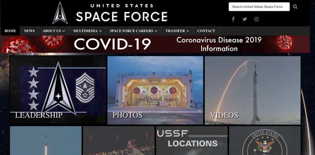
This is not the future, at least if this is the best the newest arm of the U.S. military forces can create to advertise itself. This site could really use a makeover. A tiled screen of different grayed out links is the first thing to assault users alongside text in a blaring, ugly all-caps font. It’s bland space background reminds me more of a Myspace page or a Star Trek fan blog than anything else. Somebody please connect Space Force with a UI designer.

Advertisement
Previous Slide
Next Slide

5 / 13

Department of Energy

Department of Energy

Image for article titled Good Luck if You're Forced to Use These Hideous Federal Websites
Screenshot: Department of Energy

First off, it’s never a good sign when your own website logo appears to be a low resolution image directly at the top of the page. Remember, this is the Department of Energy we’re talking about here. They’re supposed to regulate the $123.7 billion energy sector.

Advertisement
Previous Slide
Next Slide

6 / 13

National Weather Service

National Weather Service

Image for article titled Good Luck if You're Forced to Use These Hideous Federal Websites
Screenshot: National Weather Service

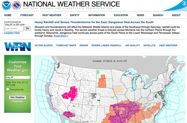
This site was on here the last time Gizmodo did a survey of rough-looking federal sites… back in 2014. Yeah, even with a different URL, nothing’s really changed. The layout is still cluttered and confusing, and it’s especially bad for those who don’t have the best fine motor controls if the main page of the site wants users to click on a very fine point on a map to get localized weather maps. Even if you type your location data into the side panel seen on the image above, it scrolls it in a tight inch on the side of the screen that is a pain in the butt to read.

Advertisement
Previous Slide
Next Slide

7 / 13

Defense Nuclear Facilities Safety Board

Defense Nuclear Facilities Safety Board

Image for article titled Good Luck if You're Forced to Use These Hideous Federal Websites
Screenshot: Defense Nuclear Facilities Review Board

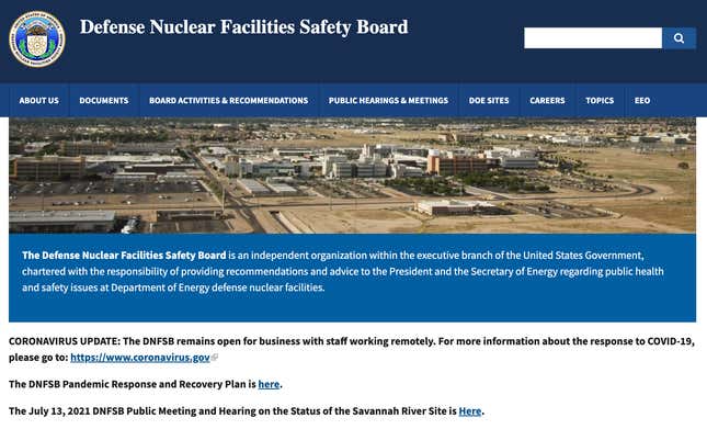
At first glance, you would think this web page is just a poster board to slideshow a few dozen nuclear facilities. Scroll down, and there’s a few dark blue boxes with unreadable black text to find the weekly reports for all the different nuclear sites in the U.S. Hell, even I know how to change the .HTML script to change the text from black to white. Come on people, get it together.

Advertisement
Previous Slide
Next Slide

8 / 13

Animal and Plant Inspection Service

Animal and Plant Inspection Service

Image for article titled Good Luck if You're Forced to Use These Hideous Federal Websites
Screenshot: U.S. Department of Agriculture

What an unexpected sight. I have no idea who you are APHIS, just based on your site. The first thing I’m greeted with is a picture of a chicken. This sub-agency to the Department of Agriculture doesn’t really let you know what the hell it is or why you’re even there. Scrolling down you’re given some “common questions” for shipping your horse overseas or bringing fruits and vegetables. This site could really do with some rearranging. Someone should also give it some clear navigation bars.

Advertisement
Previous Slide
Next Slide

9 / 13

National Science Foundation

National Science Foundation

Image for article titled Good Luck if You're Forced to Use These Hideous Federal Websites
Screenshot: National Science Foundation

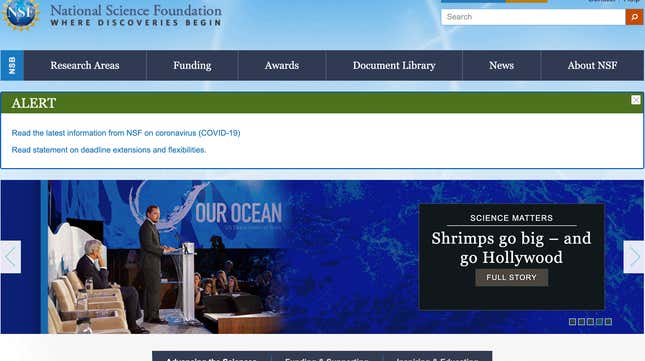
You should know better, NSF. Everything below the main navigation bar is really just a jumbled mess. The calendar of upcoming events, press releases, and social media posts (you really don’t need to include your social posts on the main page, BTW) are strung together like popcorn on a string, AKA the laziest form of holiday decorations.

Advertisement
Previous Slide
Next Slide

10 / 13

Internal Revenue Service

Internal Revenue Service

Image for article titled Good Luck if You're Forced to Use These Hideous Federal Websites
Screenshot: IRS

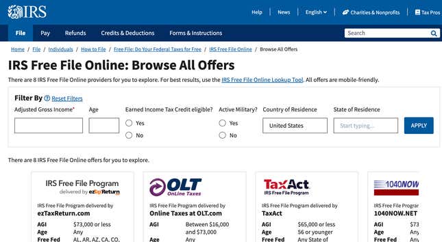
Man, you would think that a site as widely-used as the IRS would have somebody around to make sure the damn thing can be easily navigated? Try and find options to file your taxes for free on the site, and you’re suddenly jumping through hoops to find what you’re looking for. But that’s not all. Every end of the website feels like you’re trudging through a swamp to find the pertinent information so that you don’t end up getting a terse letter from the same agency somewhere down the line. Whoever finally figures out the damn IRS website should probably get a Presidential Medal of Freedom.

Advertisement
Previous Slide
Next Slide

11 / 13

U.S. Army Cyber Command

U.S. Army Cyber Command

Image for article titled Good Luck if You're Forced to Use These Hideous Federal Websites
Screenshot: U.S. Army Cyber Command

Have you noticed the rampant irony that the more tech-focused government websites are also the ugliest looking? We sure have. The U.S. Army Cyber Command site used to look even worse, but now the first thing you’re greeted with is a squashed image of military personnel in a command center before scrolling down and squinting at a rather unhelpful map of different command centers. Also, please stop including your Twitter feed on your government site? It’s not needed, and it only adds to the overall clutter.

Advertisement
Previous Slide
Next Slide

NASA

Image for article titled Good Luck if You're Forced to Use These Hideous Federal Websites
Screenshot: NASA

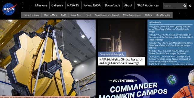
Alright, here it goes. I don’t like NASA’s website layout. In fact, I hate it. It’s cluttered, confusing, unhelpful, what have you. It’s similar to Space Force, but it might be even worse. Yes, NASA, we do like the cool pictures of your telescopes, probes, and satellites, but anybody coming in who doesn’t already know what those things are will just be looking at a mosaic of nonsense images. Please, NASA, you do not have to take up every single pixel of a page with something.

Advertisement