Why Apple Vision Pro’s menu UX on Quest Pro doesn’t work as we hope for
There is a lot of hype around the Apple Vision Pro. One of the things that got people excited the most is its interface that works only by using eye tracking and hand pinching, which according to the journalists that underwent the demo, is fantabulous. Some people tried to recreate the same experience on Quest Pro, but does it work that well? Eeeeh… not exactly. Let me tell you why.
Video review
I made a video of mine where I show you my full hands-on experience with the Quest Pro application that emulates the Apple Vision Pro menu and then give you my detailed opinion on it, highlighting the pros and cons. You can watch it here below
If you keep reading, as usual, you will find the written version of the article.
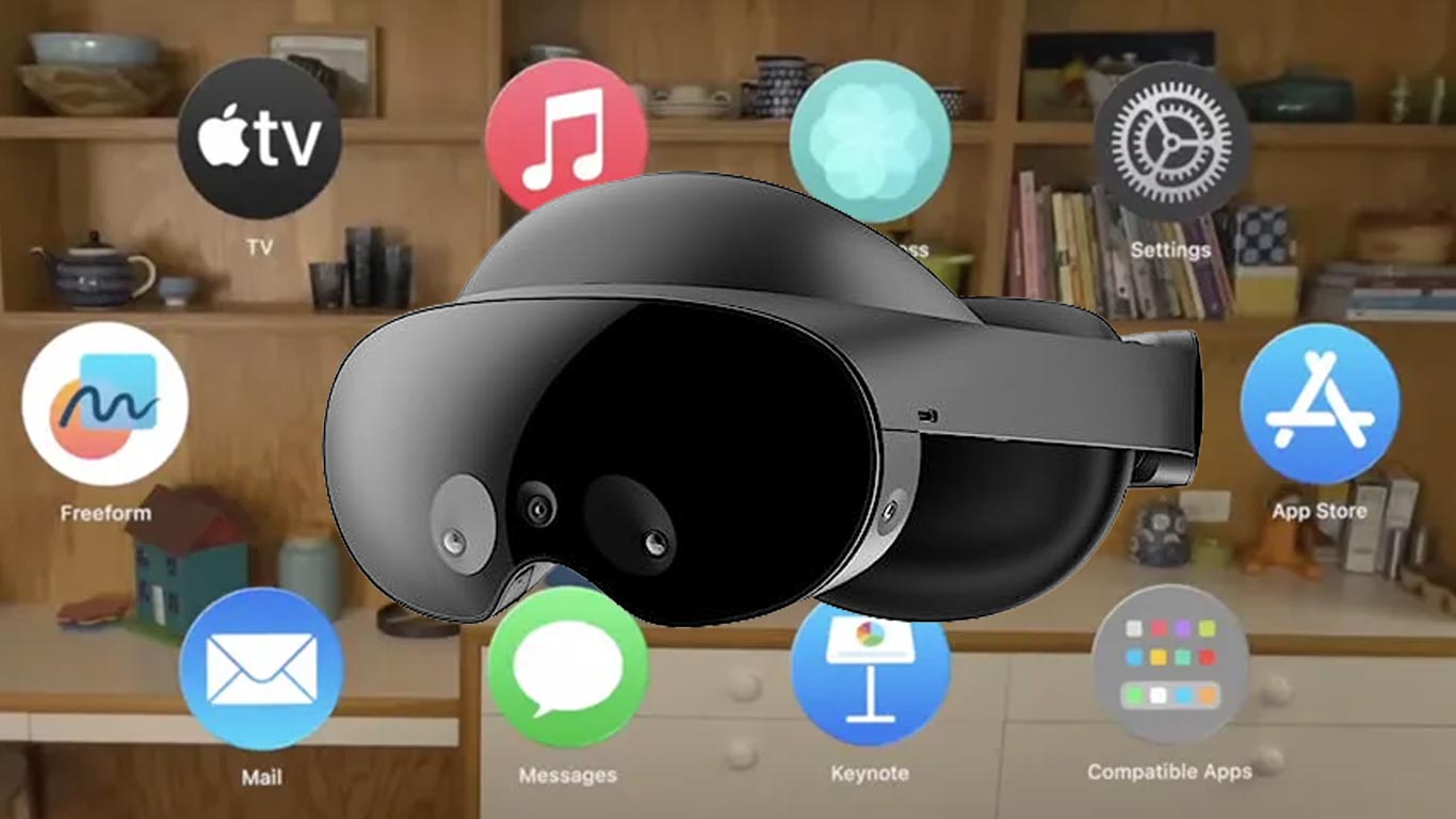
Apple Vision Pro menu demo on Quest Pro
After Apple announced the Vision Pro and showed all those videos about its UI working just by using the eyes and the hands, many of us thought one thing: we already have a device that tracks the eyes and the hands, which is the Quest Pro… can it be used to recreate the same experience? Some people actually worked towards a demo in this sense, and the first one that I’ve been aware of has been the VR influencer Thrillseeker
but then a few others followed his example. I wanted to do something like this myself, too, but I did not have not the time to implement it. But I was still curious to try one of these demo apps, to see how well the magical UX promised by Apple translates to the Meta Quest Pro. Luckily, a few days ago, I found a post on Upload VR telling that the team behind the Nova UI plugin for Unity created a demo in this sense to promote its package on the Unity Asset Store. The project is fully open-source and the APK is publicly available for everyone to download and try. Kudos to Nova, it’s always beautiful when a team shares something it did with the community (like I did with my mixed reality AI concept).
Nova UI’s Apple Vision Pro demo

The demo that Nova UI created is very simple. There is a small toolbar on the left through which you can choose one of three tabs:
- The iconic apps menu shown by Apple in its reveal of the Vision Pro
- A window with random UI controls that can be activated by eye tracking: toggles, sliders, resizable rectangles
- An about page, where you can click on the Nova link to visit the website of the company
The whole experience works exactly as if it had to run on the Apple Vision Pro: it has the passthrough view activated, and you navigate it using only eye tracking to select which item you want to interact with, and hands gesture (air-tapping, or pinching and moving the hand) to perform an action on that item.
The team made very good work trying to recreate the Vision Pro experience on the Quest Pro, with the tools that are available for Quest Pro developers. I want to make clear that every criticism that I’m going to say in the remainder of this article is not directed to the Nova team, but is just made to show that a naive implementation of eye and hand tracking may not lead to the expected results. Let’s see why.
Hands-on Apple Vision Pro UX on Quest Pro
The Mida’s touch
When I opened the application, after having activated eye tracking on my device, I found myself in front of the famous App menu. The recreation was quite good, a bit less refined than Apple’s one, but still similar to the one shown in the trailers. I started exploring it around with my eyes, and in the first few seconds, I already started spotting one good and two bad things about this system.
Let’s start with the good one: the eye tracking was actually working very well to select the app icons. As soon as my eyes were focusing on one of the icons, that icon popped up, to show that it was selected. It worked fairly well and started to convince me that the Quest Pro could actually be used to emulate the Vision Pro.
But there were two shortcomings that prevented me to enjoy the interaction. The first one was the little lag: when I was pointing at an icon, the system took a fraction of a second to actually highlight it. This was quite annoying: eyes move very fast, and the brain thinks even faster, and seeing that actually, the menu was “lagging behind” my intention was a bit frustrating. The moment that the system tells me that “my eyes are the controllers”, I automatically expect that when I point the controller at something, that thing goes into a hover state. But this happened with a little lag, which was a bit frustrating, even if nothing major.

The second problem was more annoying, though, and it is the typical problem I mention when someone talks to me about eye-driven interfaces. Yes, exactly that one: the Mida’s touch problem. Like Mida’s Kind transformed in gold everything he touched, my eyes put in hover state whatever they were looking at. This may seem good at a first impression, but it is actually quite bad. Eyes are made to explore: when you are in a space, they wander around with movements called “saccades” that let you explore the environment you are in. Eyes are rarely fixed in a position, they constantly move also to cope with the fact that the fovea region is quite small, so to have a clear picture of what you have around, they must constantly look at different things in the room. This is ok in a normal context because your eyes don’t do anything if not seeing things, they have not the power to cause anything in the space around you.
But in this case, your eyes are the controllers, so they have a practical effect on selecting objects. So when I started looking around the interface, to explore which apps were available, I found super-annoying to see the icons kept flashing in front of me. I just wanted to look around, I didn’t want to select, but I kept seeing items being hovered.
This was particularly annoying when I had nothing to select: I mean, if my intention was looking at “Safari” icon and clicking on it, the interface was working very well and was great to use. But when I was exploring the menu, I did not want to see random things activating.
Click and pinch
After having analyzed the eye selection interaction, I went on to try the click and swipe mechanics, which have been for me the best surprise of this demo. When looking at an icon and air-tapping by making the thumb and index fingertips touch, the icon flashed to show it had been selected. This mechanism worked very well. And if I kept looking at the menu and then swiped my hand while keeping the thumb and index fingertips touching, the menu swiped between its two tabs.

This part worked very well. And I was impressed it could work also with my hands on my laps. One of my biggest doubts after having seen ThrillSeeker’s video was if the Quest Pro interface could work with the hands at rest on the legs. It seemed that Thrill had to put his hands in front of him to “click” and “swipe”, but keeping the hands in front of your eyes for a long time is going to be very tiresome. Apple clearly showed that with Vision Pro people could keep their hands at rest to make it very comfortable to use.
I tried keeping my hands on my knees and to much of my surprise, the system worked both for tapping and swiping. It was incredible: the Quest Pro could use the same gesture as the Vision Pro. And I’ve found this way of interacting very comfortable: I didn’t have to move my head, I didn’t have to move my wrist… I just had to look at objects and move two fingers to activate them. This has been one of the most relaxing interfaces that I’ve ever tried in my life. It was much more comfortable than naive hands tracking a la HoloLens 2 and much better than using controllers to activate menus.

I have to say that anyway on one occasion the system did not work, and I had to put my right hand in front of the Quest to re-initialize its tracking so that when I moved it towards my knee, the detection was still working. This is a problem because means that the system is not 100% reliable.
Misdetections and interactions with UI controls
After having tried this first “menu” tab, I decided to switch to the second one to try other forms of interaction. I so started looking at the toolbar on the left to select the second tab, but for some reason, the detection of where I was looking was not doing very well.
The reason was simple: eye tracking’s performance degrades when you are looking at the periphery of your vision. This is a problem I already spotted in my early tests with eye tracking using the 7Invensun’s aGlass DK2 device. Usually, the best performances happen when you are more or less looking in front of you (and that’s why the menu with the app icons was working well), while looking away may cause some misdetections. Here the sidebar was on the left periphery of my vision, so when I was looking at the second button of the bar, sometimes the system selected the third button, and other times one of the apps of the menu. To make things worse, when the system selected another (wrong) button, the button flashed to signal its hover state, the flashing attracted my eyes (we are programmed to look at moving things because they could be potential dangers), so now my eyes were working on the wrong button for real, confirming its selection. It was very confusing.
Anyway, I managed to point and click the right button and found myself on the second tab, which was full of UI controls, including toggles and sliders.
This interface was very rich and had also some very cool controls: looking at the sliders, and moving my hands slowly to make them slide and change value felt very magical. There was also a little rectangle I could resize and move around, which was very well made, too. I had fun seeing that when things were working as expected, the interface felt very usable.

But this screen exacerbated all the problems I already described before: the visual overload with everything flashing as soon as I was exploring it, the little delay in selecting what I wanted to select, the frustration for the misdetection of what I was looking at or what I wanted to do with my hands (sometimes the air-tap with my right hand was detected as a little swipe, so instead of selecting one of the toggles, I was scrolling the list), and so on.
I noticed also that I started feeling some fatigue. My brain was a bit stressed that it had to follow what my eyes were doing. And my eyes were feeling more strained because they couldn’t be used naturally, but I had to work with them as if they were ray cast pointers. I’ve also noticed that when the system misdetected what I was looking at, I tried to “look with more intensity” at the right object… whatever it means. But the result was the same as I have when I “look with intensity” at a girl I like: nothing happened, and I just put more strain on my eyes.
Also, the eyes had to focus on elements all around me, and they found a bit tiring the requirement to look at the periphery of my vision to select the buttons on the left toolbar. In a normal scenario, we usually don’t rotate too much our eyes, and we use the rotation of our head if we need to look much on the left or the right, but here I could not because the interface was bound to just use eye tracking.
So at the end of my session with this app, I felt as if my eyes were a bit more strained than usual after I use VR.
The last screen
The last tab was just an “About” screen, showing the Nova logo and offering a link to go to its website. The link was clickable using eyes and hands, of course.
Hands-on considerations
My biggest takeaway from this demo is that a naive approach to eyes+hands interactions is not going to work. If you asked me if I would use the interaction scheme of this demo every day in XR, my answer would be: probably no. It’s too inaccurate, too confusing.
What is needed is an approach that is polished, because only polished interactions are going to be appreciated by the users. And this is something that Apple is very good at doing and has already done a lot of times, for instance with the “invention” of the mouse pointer or the improvement of touch-screen interfaces.
Let’s all remind what Michael Abrash said about UX: interactions should always work, not just work most of the time. No one would use a mouse that works 90% of the time… if a click every ten would be misdetected, we would probably throw the mouse away from the window. The same happens here: if an interface uses hands and eyes, hands and eye tracking should work 99.9% of the time. When Ben Lang tried the Vision Pro, in fact, he stated that he had just 2 misdetections in more than half an hour of the demo. It is not acceptable to have more, otherwise, the interface becomes frustrating. And from my test with this application, it seems that the Quest Pro may not be at the same level yet (or at least this demo can’t show the same level of accuracy).

It is also important to not just take the unfiltered input from the eyes. Just having the direction where the user is looking at may not be enough to create a satisfying UX: in my demo, I had two contrasting shortcomings because of this. I was pissed off by the fact that my eye saccades were making random icons activate when my eyes were just wandering around, and the solution for this problem is usually to implement a stare-to-activate mechanic. That is, you activate an object only when the eyes look at it for enough time. But if you make this time too long, you obtain the other problem I complained about: the lag of the system in detecting what I was looking at. If you only use the eye direction information as this demo was doing (because it’s the only data provided by the Quest Pro runtime), the only thing you can do to improve the situation regarding these two problems is calibrating attentively this “stare” time, but in my opinion, you will never find a value that feels satisfying.
The solution to creating a reliable interface for me is to use neuroscience. A guy called Sterling Crispin tweeted that he worked on a team of neuroscientists working at Apple for the Vision Pro, and their purpose was analyzing the user’s biodata, what he was doing, and predicting what he would like to do next. In his long tweet, he mentions some interesting studies like “One of the coolest results involved predicting a user was going to click on something before they actually did”. I think that only an AI-powered analysis of the user’s biometric data can tell you if he is just looking around for some saccade movements, or if he’s trying to look at an icon because he wants to launch an application. He for instance states that the eyes behave in a different way when they expect you to click on something: “Your pupil reacts before you click in part because you expect something will happen after you click. So you can create biofeedback with a user’s brain by monitoring their eye behavior, and redesigning the UI in real time to create more of this anticipatory pupil response”. All of this is fascinating, and I think these studies are the only way to make an interface that is really usable. In fact, using these technologies, you can solve both of the problems I told you before: you can filter out all the movements that do not show anticipatory interest in clicking (avoiding the Mida’s touch) and you can predict where the user will look at next to click (reducing the hover lag).
I’ll leave you the tweet here below as a reference.
The last level of the solution to take is to improve the graphical part of the UI to make it more suitable for eye and hand tracking. First of all, if the eye detection has the Mida’s touch problem, I would avoid making all the elements flash in a very visible way even for the shortest eye look.
Then I would probably make the graphical elements of the UI bigger and make them more distant the one from each other, to make sure to minimize the risk of misdetection and cope with the fact that eye tracking may not be always accurate. The left sidebar of the demo is very small, so the tracking error is enough to cause a misdetection on the button to over.
And to keep the tracking error the lowest possible, I wouldn’t put elements in the periphery of the vision, because looking at them is more error-prone, and also creates more eye strain.
I remember that when I tried the “eye look + controller click demo” by Tobii at AWE US last year, I did not feel the same sensation of discomfort that I tried here. Probably it helped the fact that icons were bigger, and there were fewer options to select from, so there was less of a flashing effect. Maybe this can be another guideline to follow when designing similar interfaces.
At the end of the day, what I want to convey to you is that when it works, the eye+hands interactions are amazing. They feel natural, comfortable, and quick. They are really magical. But if they are made just with a naive approach, they can become frustrating. And it is not only me saying that: a research paper reported by Apple Insider states that “Gaze+Pinch is faster & less physical effort [than hand tracking alone] if targets fit the eye tracker accuracy“. The meaning is that if eye tracking does its job, this system is better, if eye tracking misdetects the targets that the user wants to select, it is better to use other input mechanisms.
Many people asked why Meta hasn’t developed a similar interface on the Quest Pro. I think the reasons may be two:
- Meta is focused on creating a coherent ecosystem between all the Quest devices, and if the Quest Pro starts working in a different way than the Quest 2/3, this may hurt this goal
- Meta has probably not yet found a way to make this interface usable. As I’ve said, maybe they created something that works only 90% of the time and it is not ready to be shipped to dozens of thousands of customers
Final Conclusion

This experiment showed me once more that XR applications should be tried, and it is not enough to watch them on a video. I’ve learned a lot trying this demo, and I invite you all to do this, too, by downloading it at this link.
Now I’m also more curious to try the UX of the Vision Pro because if many journalists said that it was very good, it means that Apple may have cracked the formula to make it reliable, natural, and usable. And this may be an amazing foundation for its headset.
I hope you liked this article, and if it is the case, please use your hands and your eyes to share it on your social media channels with all your fellow XR enthusiasts 🙂 This would give me a happy facial expression!
(Header image mixing elements by Meta and Apple)
Disclaimer: this blog contains advertisement and affiliate links to sustain itself. If you click on an affiliate link, I'll be very happy because I'll earn a small commission on your purchase. You can find my boring full disclosure here.